
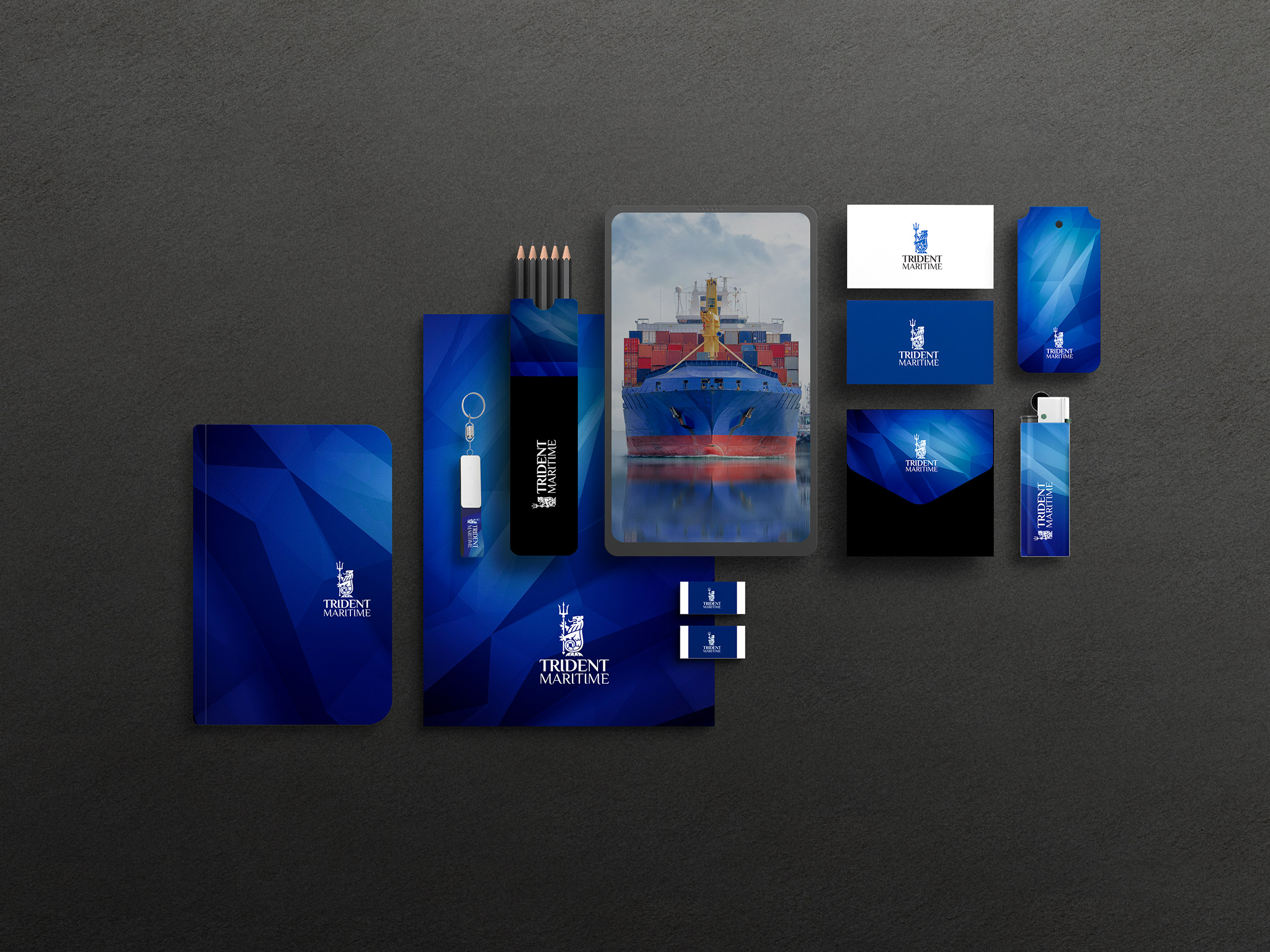
As part of the development of the logo and brand book for the crewing company from Odesa, the basic requirements were set: to keep the company’s corporate logo and pick up fonts and other elements of the brand book.
In the process of developing the corporate style, more than 10 variants of fonts and colors, as well as their variations, were proposed. The main thematic color left classic blue, adding a little ink shade.
The task was to choose a stylish, but not complicated font that will give the company its own recognizable style, but at the same time does not hurt the eye and does not draw attention. In this style, a color solution and a geometric background abstraction were developed.
The design of the business card is presented in two variants: the design of the business card to perform in the premium version on design cardboard embossed and imprinted, as well as the design for standard digital printing - without embossing.
We have developed the design of phone cases: in general maritime style, with a tanker - as a symbol of the main activity of the crewing company, as well as with geometry in corporate colors.
As part of the brand book was also developed: corporate blank, envelope, design of a phone case, company banner, screensaver for the desktop.
The term of the turnkey brand book development depends on the readiness of the Customer to engage in the process and give operational feedback to the team of developers.
The creation of the logo and brand book design for the crewing company TRIDENT MARITIME took 3 weeks from the completion of the task to the issuance of the archive with all the sources.
See also:
By topic: corporate identity development, logo design, brand book, business card design, crewing company corporate identity