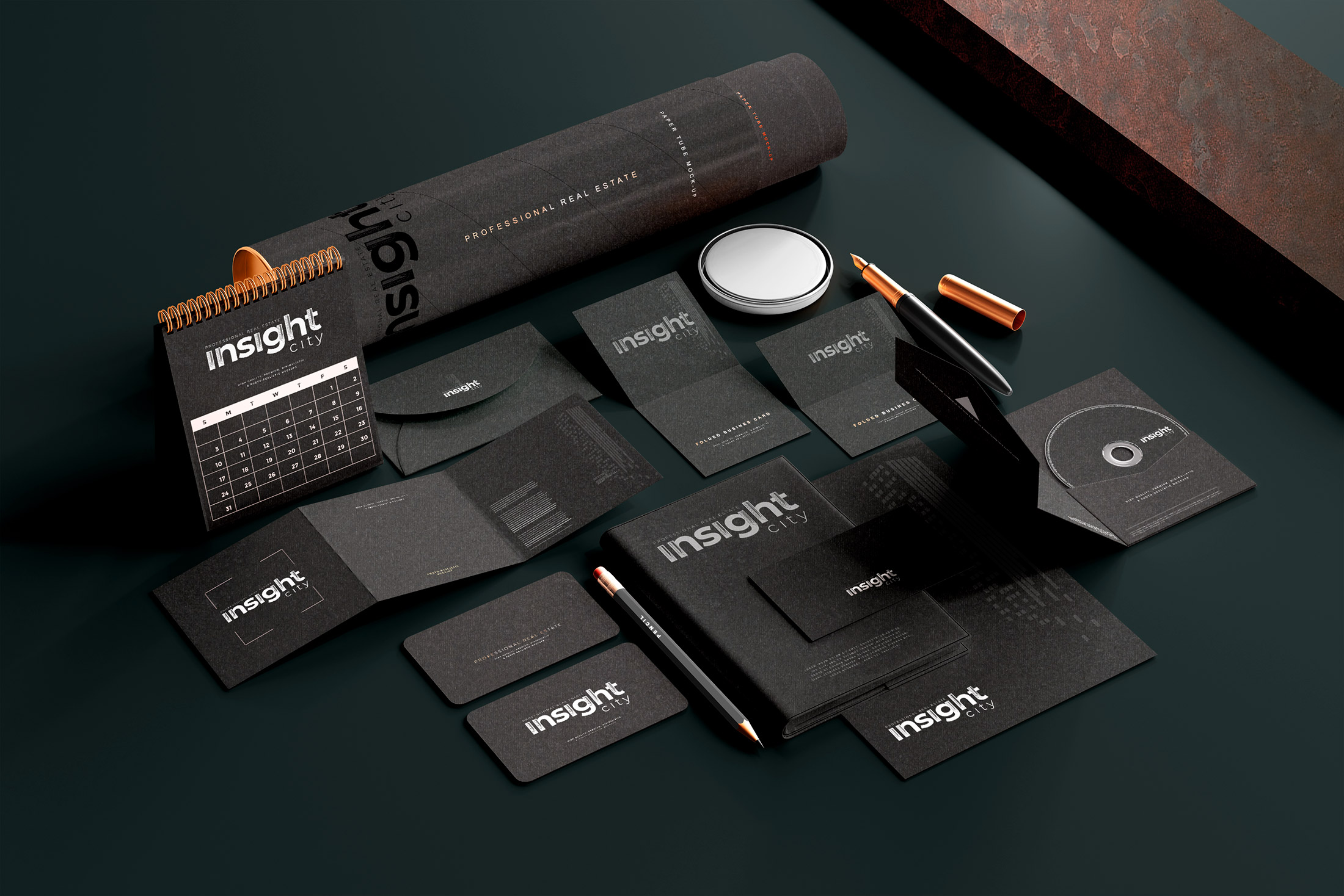
The primary task in the development of stylistics for a real estate agency is to stand out from the many participants of a diverse real estate market. We bet on what the designers do not risk and are afraid of all companies - we focused on black color, developing a brand book. Black color - which stands out and catches the eye everywhere: on signs, banners, screens... Even in a pack of business cards - 99% white and one black - at the premium real estate agency Insight City.
In the process of developing a corporate identity, it was important to maintain a strict style, do not bend with saturated elements and carefully place emphasis. We added red accents to the elements and added silver to the printing products by mixing with premium materials.
Developed a bold stylish minimalist brand book in black and white with elements of silver and red.
It turned out cool and very brave - created a brand book, charged for success in real estate.
See also:
