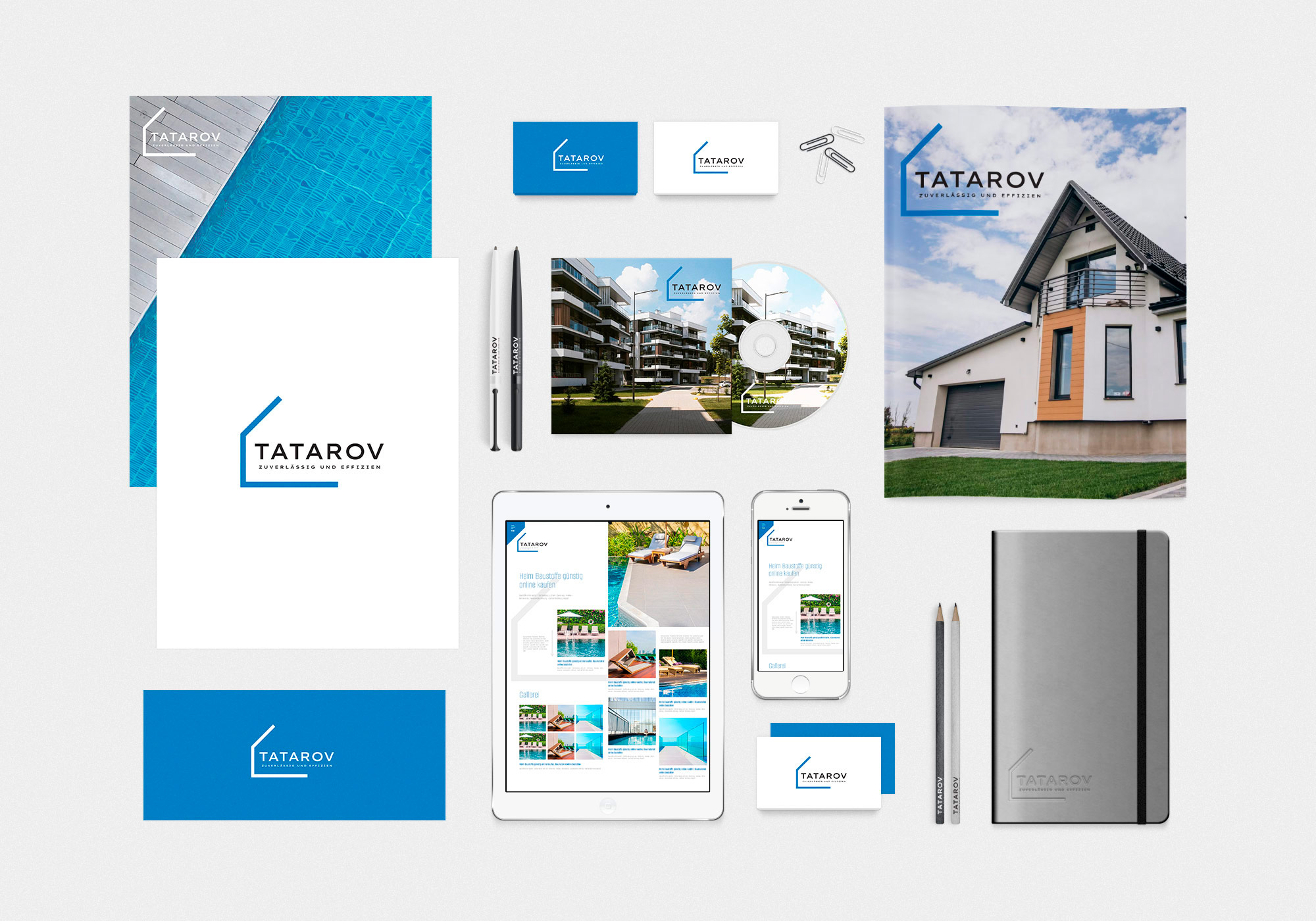
The designer of mc design studio created a visual identity that reflects the professional, innovative and dynamic nature of the company.
Logo
The main element of the corporate identity is the logo, which combines simplicity and sophistication. It uses laconic lines and geometric shapes that create a sense of stability and reliability. The logo is easily recognizable and well scalable, which allows it to be used in different media and on different surfaces.
Color palette
The company's color palette consists of restrained but expressive colors. The main color is deep blue, which is associated with professionalism, trust and technology. The complementary colors are light shades of gray and white, which emphasize the elegance and purity of the design. This palette ensures a harmonious look in any context, be it print, web, or promotional materials.
Typography
The corporate style is based on modern and easy-to-read typography. Fonts were chosen for their versatility and readability in both print and digital formats. The main font is a geometric sans-serif, which emphasizes the company's technological and progressive nature.
Visual elements
Additional graphic elements such as icons, lines and patterns are used to create a unique style. They add dynamism and individuality to the design. These elements are used in all marketing materials, providing a single visual language.
Tatarov's corporate style is successfully integrated into all aspects of the brand: from business cards to the website and advertising campaigns. This allows us to maintain a unified image of the company, increase brand awareness and create a positive impression among customers.
See also:
On the topic: corporate style, logo design, corporate identity development, corporate identity for a construction company