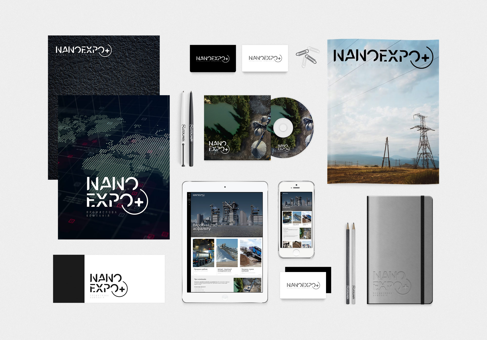
The corporate style of the Nanoexpo+ company is carefully designed to reflect its professionalism, reliability and modernity. The designer of the mc design studio focused on creating a unified and recognizable visual language that emphasizes the company's key values.
Logo: The central element of the corporate style is the logo, which consists of clear geometric shapes and a modern font. The logo reflects the technological and innovative nature of the company.
Color range: A restrained and professional color palette is used, dominated by black, white and gray colors. This emphasizes the seriousness and reliability of the brand.
Fonts: The same font is used for all text elements, which ensures unity and consistency in all materials. The font looks modern and easy to read, which is important for communication with clients and partners.
The corporate style of "Nanoexpo+" is a successful example of a modern and professional design that effectively reflects the company's mission and values. A clear structure, modern fonts and a carefully selected color scheme create a single visual image that contributes to brand recognition and customer trust.
On the topic: development of corporate style, brand book design, brand identity, brand book for a cultural project
