
The corporate style of the "LU-MO Cosmetics" company was created to emphasize the elegance, luxury and naturalness of the brand.
The designer of the mc design studio paid great attention to details to create a unique and recognizable image of the brand.
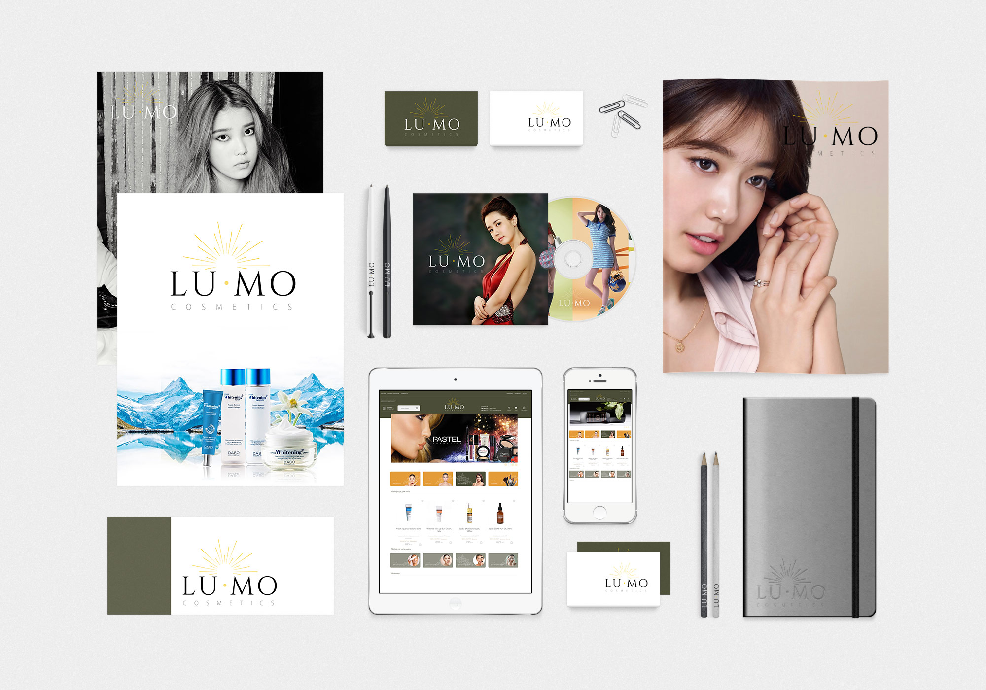
Logo: The logo of "LU-MO Cosmetics" is an elegant design using a sunbeam, which symbolizes light and purity. The font used has a classic yet modern look that strikes a balance between traditional and new.
Color scheme: The main colors are white, gold and olive. White symbolizes purity and simplicity, gold - luxury and high-quality products, and olive adds naturalness and elegance.
Fonts: An elegant and refined font is used, which emphasizes the premiumness of the brand. The font is easy to read and adds a high class feel to the overall look.
The corporate style of "LU-MO Cosmetics" is an excellent example of an elegant and professional design that emphasizes the luxury and naturalness of products. The use of restrained colors, sophisticated fonts and high-quality images creates a unified and recognizable brand image, which promotes customer trust and increases brand recognition in the cosmetics market.
See also:
On the subject: original logo design, development of corporate style, corporate style of Ukrainian companies