
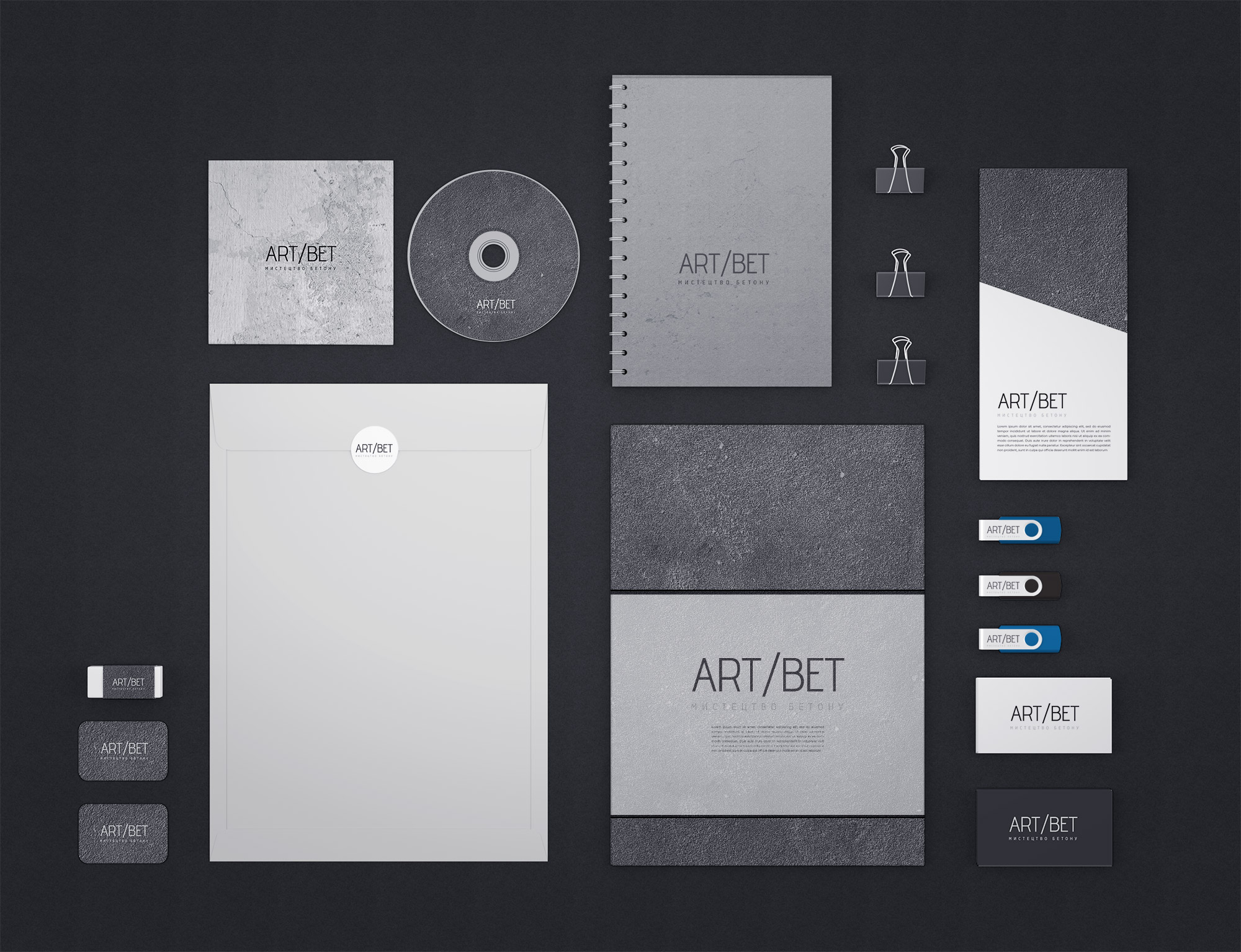
The corporate style of the "ARTBET" company is designed to reflect its industrial nature and emphasis on innovation in the field of concrete processing. The design developer created a visual identity that embodies simplicity, restraint and professionalism.
Logo: The "ART/BET" logo consists of concise and clear lines that resemble the texture of concrete. The use of simple geometric shapes emphasizes the stability and reliability of the company. The company name is presented in a sans-serif font, which adds a modern look.
Color scheme: The main colors are gray, white and black. Gray is associated with concrete and strength, white adds space and purity, and black emphasizes professionalism and seriousness.
Fonts: A modern and minimalist sans-serif font is used, which is easy to read and adds style to all materials.
The corporate style of "ARTBET" is the embodiment of minimalism and industrial aesthetics. The use of gray color, concrete texture and modern fonts creates a single and recognizable image of the brand, which emphasizes its reliability and professionalism. This style effectively communicates the company's core values and helps create trusting relationships with customers.
See also:
By topic: original logo design, development of corporate style, corporate style of Ukrainian companies